things what I writ

touche touchy touchpad

I’m not entirely sure whether this is a failing on my part or a failing on their part, but since there was a failure, I’m going to blame them, but I’ve only just realised after about 4 years that there is a key on my laptop which toggles the touchpad on and off which sounds like it might be a good idea which it probably is if you know that that is indeed what it does. which I didn’t. until yesterday.

I expect that if I’d been through all the options in the documentation I would have known about this key from day one, but just to be clear, it isn’t a key which just does one thing, like, say, a mahoosive windows key next to your space bar that you keep pressing my mistake. no, this is a softhard key. not a shifted or ctrl-alted regular key, but a key magically enabled with a combination of the ‘fn’ key and F7. in other words, fn-F7. which looks like it should be the mathematical evaluation of the number of ‘f’s I used trying to figure it out, but it in fact just a combination key press that you actually can’t perform with one hand. which is why it should be difficult to do. and obvious what it does.

I should point out that this is just one of a number of function keys mapped to the F keys that do useful things, like swap displays (glyph of a monitor), adjust volume (glyph of a speaker), adjust brightness (glyph of a sun thing), suspend, resume, shut down, etc. (glyphs of Zzzs, standby buttons, etc.), but this one has the least recognisable representation of its consequent action, to the point where I just assumed it did something I would never want to do. knowing now that it might actually be useful is too late, since I’ve already somehow used it by mistake to disable a hardware component that is actually useful resulting in me reinstalling drivers, users, and very nearly the entire operating system. why not just search online for this annoyance and surely someone else will have come across it? well, this isn’t exactly the people’s choice of laptops – acer ferrari 5000 – nice as it is. the only thing you’ll find online is reviews about how nice it is, albeit with a bit of a sticky touchpad, and instructions on how to disassemble it. its just a badly designed button. and it had me fooled.

I’d love to show you exactly what this offending item looks like, but frankly, I can’t quite summon the energy to photograph it, edit it and upload it, so you’ll just have to take my word for it. suffice to say, the graphical representation of someone using a touchpad, in light blue, on the F7 key of my laptop, looks a bit like a canary on a wing mirror. I mean, I know what its supposed to be now.


walk this way

those lovely looking people with the astro-turfed terrace at archibald ingall stretton obviously understand that if you really want to find them, you probably know how to use your own map, and so they have instead provided you with the more immersive user experience of doing the walk for you, so you know what to expect. it tells me everything I need to know about a daily commute from the nearest tube station in a way that Transport for London really never can, complete with pithy social commentary on, amongst other things, the relative worth of free news (although I might have recycled).

try for youself. I rather like the journey from Tottenham Court Road.


listening post: aphex twin – flaphead

in praise of flickr. again.

245/365

I have, a number of times, errantly extolled the virtues of the flickr user experience to such an extent that I am probably some kind of fan-man. that is to say, I’ll often be asked what I consider to be a good example of user experience design, when, frankly, its sometimes easier to explain to people what I do by demonstrating what it means to a user in a practical application, rather than a more ethereal dissection of human computer interaction and the history of pointing at things with disconnected devices and why I chose orange for a headline. notwithstanding the feature creep of recent years and the freakout that was the acquisition by yahoo! which was erroneously blown up into some kind of photo-apocalypse, the flickr experience is still one which supports everything I want to do in a way that I like to do it and doesn’t ask or compel me to do things I don’t want to do in the middle of things I’m half way to accomplishing. it is still, 5 years or so after first using it, one of the very few sites I access without going via some kind of API and amazon cloud captcha interface which abstracts the operations and allows me to fiddle about and aggregate any number of similar services so that I forget what I was doing in the first place much like writing this sentence. flickr, the site, is, of course, its own presentation layer on top of its own services, and so is only one of a number of full-featured experience architectures that I might decide to opt into or somehow leverage. but, in the end, its the seamless integration of those services, the consistent, coherent application of visual design components and the logical, meaningful management of data and taxonomy that pulls everything together so neatly. and I can write little notes with smiley faces on. there can’t be anything better than that.

there are some features of flickr that I never use. galleries. favourites (much). but then, I know they’re there if I choose to opt in, but on a daily basis, they don’t interfere with my operations. this is probably because I’m not very popular. I expect that insanely popular flickr users are bombarded via notifications of additions to galleries, favourites, and invitations to groups like Sword of Damocles ur got exceelent PIKTUREs add 1 comment on a billion animated gif 600×600. but then, you can decide what to do with those notifications, and anyway, if you’re insanely popular, you probably have to deal with the popularly insane, but at least flickr will provide you with the tools to manage that effectively and efficiently, but the good folk at flickr understand scalability and the effects on user operations. at least, I think they do. I mean, with about 6000 photos a minute or something getting uploaded and each one of those objects existing as a unique entity with all the associated user operations, I’m thinking they’ve considered scale.

in the end, as far as flickr is concerned, I’m just a satisfied user. and I pay for the privilege. and I don’t often say that.

good enough for you, good enough for me

98/365

why does it take so long to decide which platform which gadgets which colours which page width which font I might want to choose when setting up a blog when I could have spent the same two weeks writing a number of entries that would probably have answered those questions in a way that might become self-evident? because I like doing that. I like fiddling with the bits. I think it makes a difference and notwithstanding the obviously hacked together html and javascript and third-party widgets and nonsense I’ll use once and throw away even though it will wreck the template I spent two days creating by hand because my blogging platform doesn’t remember what I did before, I hope you think it makes a difference too, because that’s why I did it.

well, I kind of did it because I like orange, but there is more to it than that, honestly. I mean, I’ve got asterisks. they’ve got to represent something, like the concentric yet angular growth of my brand as symbolic of the acquisition of knowledge and its application in providing solutions regardless of the problem. or that they’re nice. and I’ve already used one somewhere else so I’m stuck with it. also, I spent at least a day deciding whether to use a single or double colon in the page title since I know that a a single colon with no space is the format that will be used to concatenate the blog title and an entry title and so there’ll be some kind of consistency there but hey, I quite like the double colon thing even though it’s largely meaningless. in fact, I would have finished this entry ages ago had I not decided that I suddenly wasn’t keen on the list styling and so just made some ridiculous and undoubtedly browser-breaking tweak to the css using percentages of ems just to calm myself down.

still, if its good enough, its good enough. I’m not paying myself to do this.


listening post: supergrass – mary

how to break a dslr

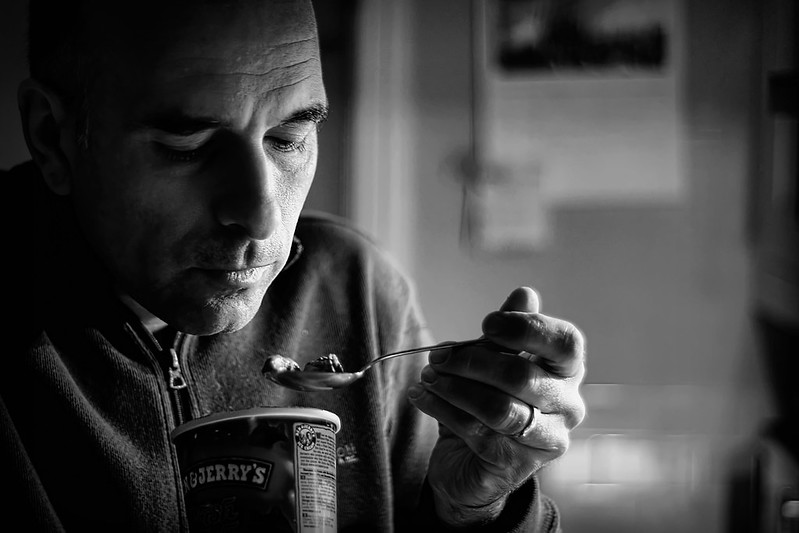
338/365
338/365 by Tim Caynes

I have found that it is really quite easy. It goes something like this.

when you are planning your daily shot for your 365 project, consider taking a shot in your kitchen, because not only does it have lots of shiny surfaces and interesting highlights and shadows cast by the ambient and spotlights all over the place, but also it has a rather nice flagstone tiled floor which is hard as the place that’s even harder than a rock or a hard place. in setting up your shot, consider using your tripod, as that has really long extendable legs which will enable you to lift your camera about 7 feet in the air for maximum height, but do ensure that when you sit your camera, mounted on its hot shoe, into the tripod head, that you don’t quite attach it properly, so that if you were to somehow have the tripod + camera approach the horizontal, then the whole thing might become somewhat unstable, and you never know, it might even fall off, just as you’re holding the tripod, fully extended, above your head. imagine that.

well, you don’t have to imagine that, because I can tell you exactly what transpires. in a sickening mashup of of ‘breaking’ sounds, your not-very-old dslr drops like a stone from about 7 feet in the air, directly on to the aforementioned flagstone tiles and bounces across the floor unceremoniously in a clattering dance of death until it crashes off a cupboard and twirls a little death spiral at your feet. it is, apparently, dead.

still, don’t panic. it might just have suffered a small fracture or something. after the obligatory curse and stamp of feet like a small child, I picked up my a300 and tried to see what might have dropped off it. as far as I could tell, nothing had. also, there was no rattle, and no broken glass, which was particularly good, as I’d only bought the lens currently attached to the camera about a week ago. I mean, there were a few things hanging off, and the battery was now in the living room, but apart from that, everything looked miraculously intact. oh joy, I spake, rather too early

it took a couple of days for me to realise that things were actually quite wrong. as I’d been struggling to get focus with my new 50mm, I had just assumed I was still at fault for cropping myself to the right repeatedly. only after a couple of fixed test shots did I work out that in fact, everything was misaligned. what I saw on live view was actually 6 inches or so to the left different to what was captured. I’ve since discovered that this means the sensor is misaligned or something suchlike, which basically means, a bit broken.

arse.

50mm autofocus fail

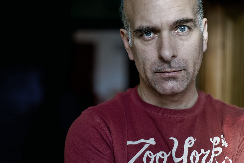
321/365
321/365 by Tim Caynes

It has been a little while since I acquired my new Minolta 50mm lens for my Sony A300 and I’m steadfastly refusing to take any photos where the thing I was expecting to be in focus is in fact in focus. I’m am now quite adept at getting most of my nose quite sharp but since there is a significant surface area to work with there I’m not counting it as a result. The thing I’m really trying to grapple with is while I’m still locked in to my 365 project and consequently taking far too many photos of my own face every day just how do I get my new lens to focus on one of my eyes. Either one, I’m not bothered. Just focus, pin sharp, like I know you can. On that blue bit in the middle where I’m trying to look all angsty. Yes, there. No. That’s my nose again. Grrr.

I am probably making the proverbial rod for my own primordial back being firmly clamped at f1.7 until I get this right, but then, that’s not about focus is it, its just about depth of field. I could have a depth of field like f0.3 or something and still get one of my bloody (for they are, after about 10 hours of trying) eyes in focus notwithstanding the fact that at that aperture I’d probably get eyelash bokeh but that’s not the point. The point is, I haven’t mastered this lens yet. And I’m running out of time. Kind of. This year’s 365 project concludes neatly on December 31st, after which I shall probably treat myself to the flickr equivalent of a 3-week Norwegian cruise, that is to say, I might not post anything for a day or so. Without my 365 project, I’ll not nearly be so inclined to invest the hours it will apparently take to crack this self-portrait focus failure which would be troublesome as I rather like the lens. I guess I have 30 days to sort it out.

Archives
Categories

Share