Things what I writ

I sometimes write nonsense about things to try and sound clever

the articulation of design

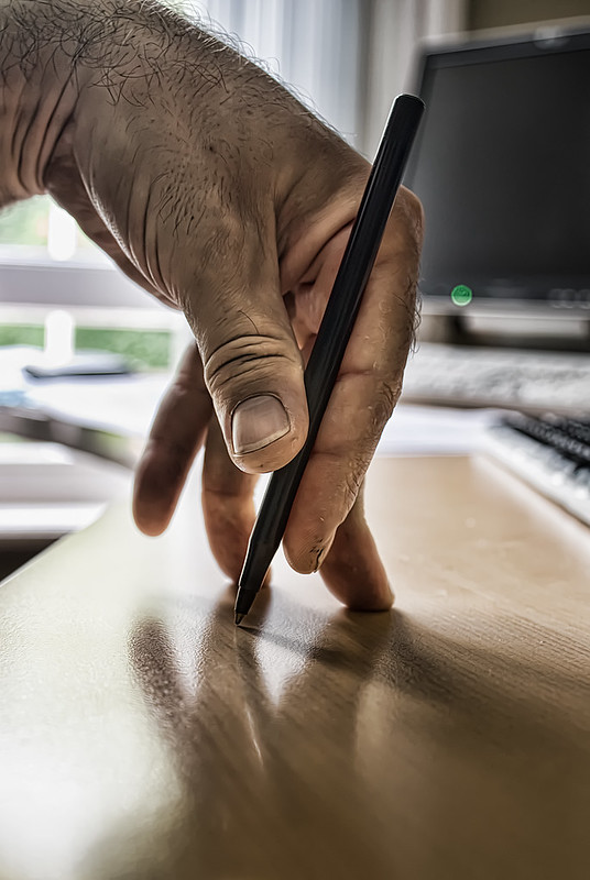
196/365
196/365 by Tim Caynes


had a lovely long conversation today about what design is and why we do it. I paraphrase

in order to explain the progression from what we understand to the things we make we undertake a deliberately unstructured approach to divining meaning and distilling insights such that we might evolve and create structures and make sense of that which we’re analysing in order that we can confidently develop evidence-based hypotheses that describe the behaviours we want to effect and the human outcomes we want to see

but also sometimes we just make things up because nothing makes sense and it’s not really that bad if you just have a good idea and see if it works because if I really only created things with a direct, methodical, causal relationship to the user intents and behaviours I need to support then I would actually be pretty bored because the act of creation must be the sum of all knowledge and that means that since I know lots of stuff I probably know many of the outcomes and I have a pretty good idea of what might work but omg that’s just designing for yourself how dare you that’s not what we do call yourself an experience designer actually no

but in the end the design we do is only as good as our ability to articulate its value. value to users. value to stakeholders. value to the universe. and most importantly the value to us, the creators. for if I invest in the creative endeavour with disregard to the impact it has on me then I deny myself the opportunity to explore my capabilities, weaknesses, inspirations and, fundamentally, my ability to communicate new ideas

it’s the articulation of design that gives design meaning and value. it’s an acquired skill. you have to practice and get good at it. but once you’ve got it, design makes sense. not just in the way you describe it to others, but how you describe it to yourself. and that’s where you begin to understand the real value of what you do

and yes, italic

update: much talk regarding articulating the value of design at this week’s Leading Design conference which had many heads nodding including my own but in an agreeable way not a falling asleep way and while I suggest that the value of articulation can be most readily appreciated in the way it enables you to understand and evolve your own work the gaping void between doing design and expressing the value of design is still largely being quacked into, leaving stakeholders and business leaders to cup their ears at the silence. the need to describe value has never been greater and the Leading Design conference connected some lovely people to share their experiences and advocate some effective methods for doing just that so thank you to Andy Budd and Clearleft for making it happen.

on specificity

when we were trying to find a suit for my dad when my sister got married, there wasn’t much of a plan. I mean, there wasn’t a particular style or look we were going for. we didn’t really have a great understanding of what might be the right thing, other than it should probably be a bit, like, summery. but beyond that, we were at a bit of a loss. so we thought we should consult the expert in these matters. a tailor.

having explained to the best of our ability exactly how we thought my dad’s suit should manifest, having stumbled over at least half an oxford english dictionary and a couple of rogets, we alighted on a deafening silence, accompanied by an awkward gawping stare, waiting, almost reverently, for said tailor to deliver a verdict. and when he spake it felt as like it were the very voice of heaven cascading over our heavy shoulders. and he did spake unto us thus: “you need something a little…” yes? “…a little…” go on? “well…”

“unstructured”


“let me show you”

actually, it was the perfect description of what was required. I can’t really describe to you how the suit looked, but I think you can get an idea from that single word. but it isn’t the word that made the difference. it was the acknowledgement that specificity in of itself wasn’t the thing that was providing any clarity. it was using the right language based on the context that made the difference. and he just made that word up. but it was exactly the right word at the right time, based on the information he had.

I am the least academic person I know. I’m a terrible intellectual and appallingly unintelligent. do I know tufte? no I don’t know tufte. have I been getting away with it as a user experience designer for ten years? maybe. but you can’t personally say that unless you’ve worked with me and I’ve disabled comments for anybody who has worked with me.

I’ve done good things though. I have apparently made clients happy. I haven’t changed the world. I haven’t set out to. but to the best of my abilities I design for the user based on the evidence I have. much like the tailor. I really don’t know whether I’m using a taxonomy, an information architecture, a flow diagram, a blueprint, a journey map, a haynes manual, a cognitive disentropy matrix or whatever. I could really not care what those things are and the limits or constraints of what they’re supposed to communicate.

but I’m good at finding the word. and if I can sit in a room, with a pen and something to use it on, then I can probably show you what I mean. and that’s about as specific as it gets.

listening post: gemma hayes – shock to my system

Your design resume is awesome but I don’t care

I’ve spoken a lot in the last few days about what user experience is. My best descriptions don’t include those words any more. I’m finding that I can only express the qualities I look for when I’m hiring UX professionals in terms of life experiences. Meaning that I tend to prioritise specific academic qualification or checklists of skills much lower than I prioritise the things that make you the person that you are. And I have to acknowledge that that makes it almost impossible for potential candidates to formally structure an approach that I might respond positively to. My assessment of what makes an engaging resume or portfolio does seem to be at odds to the majority of hiring managers in the field or, more specifically, recruiters. I’m grateful to my UXPA mentees for pointing that out, since otherwise I may just consider that everyone is writing terrible resumes which is why they’re finding it difficult to penetrate into the first level of human interaction with me – an interview.

I’ll be honest. A lot of resumes I see are terrible. But worse than that, a lot of them are just not very compelling. I don’t find anything in them that makes me want to invest the effort I really should. There’s nothing in there that makes me interested in who that person is. I try, and fail, to respond positively to a checklist of application software, when, frankly, it’s meaningless to me. I have an expectation that anyone who is applying for a design role can manage application software. If you can’t, I’ll teach you how. That’s not the thing that makes you a designer. What makes you a designer is your ability to think, articulate, challenge, interrogate, evolve, be bold, be different, be confident, be accountable and have the courage of your conviction. I really need to see something of that in your approach to me, since that’s really what differentiates you. It might just be how you word a personal statement or whatever you call it. It might be in the narrative that forms the basis of your portfolio. It might be that you’ve got an interest in garden furniture. Really, I can’t tell you what it looks like, but I have to respond to you at a level more significant than simply a well-structured document. I have to work with you. I have to like you. So give me a sense of what that might be like, rather than letting me know how good you are at using Axure.

In the end, I can only offer a personal opinion. I’m the least professional professional I know. But since I’m hiring designers, it might be useful, or at least interesting. I’m willing to accept it might actually just be more confusing. But if you were considering working with me, at least you now know something about the things that make me the person that I am.

listening post: ryan adams – so alive

Design worth doing

I’m in a hotel room with half a bottle of zinfandel and a packet of mini eggs and I’m considering what design means to me which is surely a place that should be populated with mental road signs that only say STOP but curiously say GO like some alternate roadwork universe wherein the boards are all in my favour but I don’t believe them so I immediately inadvertently drive into a ditch which coincidentally was signposted WAKE UP.

Which is by way of unconnected allegory some reference to a dichotomous puzzlement that’s poked my cheek with wet finger pulling a face that says ‘what is design worth if it’s not design worth doing?’ which is some curious garlandian manifestation that has brushed my conscience and ultimately led me to question the thing that I do. Or, at least, the way that I do it. Or maybe it’s why. I’m not entirely sure.

I like designing. I’m quite good at it. I’m lucky enough to do it as the job I get paid for that supports me and my family and my dog and my craving for mini eggs. I don’t change the world with it, but I think, and I create, and I make, and I use unnecessary commas, and everything is quite good with the world. But it’s not a world I’m changing through design. I don’t subscribe to a manifesto that I may have written, consumed, co-opted or saved in google reader, that states that the reason I design the things I design is somehow for the betterment of design as a whole and some better world for the future. I design because I’m a designer. I’m fine with that.

That’s not to say there might be a better way for me to design. That might even mean there’s a better me by design. There are plenty of ways that I, my team, my company, my profession can be better, braver, different in the way design gets realised. And I think that’s something I can try and do something about. I’ve been inspired with that wet-fingered conscience-brushing episode to consider that better way. I’m acknowledging that my hypothesis hasn’t necessarily tested well and I can learn from that and iterate and test. I’m allowing myself to fail in pursuit of a better design me. And I believe that probably is a thing worth doing by design.

But there are others out there for whom that isn’t enough. There is more to design than simply design itself and that more is what can really change the world. That truly is design worth doing and it requires the breath of dreams to power the wings of angels and you know those angels exist but they look just like you and me or maybe in my case about 20 years younger and they actually don’t have a funny noise coming from the exhaust of their Vauxhall Zafira but you know I digress the point is THOSE ANGELS NEED TO FLY.

Design worth doing is a reflection of the change you want to make. Do what it takes to make the change happen. Maybe start with designing a bigger bag of mini eggs or something. OH YOU KNOW WHAT I’M SAYING.

in praise of flickr. again.

245/365

I have, a number of times, errantly extolled the virtues of the flickr user experience to such an extent that I am probably some kind of fan-man. that is to say, I’ll often be asked what I consider to be a good example of user experience design, when, frankly, its sometimes easier to explain to people what I do by demonstrating what it means to a user in a practical application, rather than a more ethereal dissection of human computer interaction and the history of pointing at things with disconnected devices and why I chose orange for a headline. notwithstanding the feature creep of recent years and the freakout that was the acquisition by yahoo! which was erroneously blown up into some kind of photo-apocalypse, the flickr experience is still one which supports everything I want to do in a way that I like to do it and doesn’t ask or compel me to do things I don’t want to do in the middle of things I’m half way to accomplishing. it is still, 5 years or so after first using it, one of the very few sites I access without going via some kind of API and amazon cloud captcha interface which abstracts the operations and allows me to fiddle about and aggregate any number of similar services so that I forget what I was doing in the first place much like writing this sentence. flickr, the site, is, of course, its own presentation layer on top of its own services, and so is only one of a number of full-featured experience architectures that I might decide to opt into or somehow leverage. but, in the end, its the seamless integration of those services, the consistent, coherent application of visual design components and the logical, meaningful management of data and taxonomy that pulls everything together so neatly. and I can write little notes with smiley faces on. there can’t be anything better than that.

there are some features of flickr that I never use. galleries. favourites (much). but then, I know they’re there if I choose to opt in, but on a daily basis, they don’t interfere with my operations. this is probably because I’m not very popular. I expect that insanely popular flickr users are bombarded via notifications of additions to galleries, favourites, and invitations to groups like Sword of Damocles ur got exceelent PIKTUREs add 1 comment on a billion animated gif 600×600. but then, you can decide what to do with those notifications, and anyway, if you’re insanely popular, you probably have to deal with the popularly insane, but at least flickr will provide you with the tools to manage that effectively and efficiently, but the good folk at flickr understand scalability and the effects on user operations. at least, I think they do. I mean, with about 6000 photos a minute or something getting uploaded and each one of those objects existing as a unique entity with all the associated user operations, I’m thinking they’ve considered scale.

in the end, as far as flickr is concerned, I’m just a satisfied user. and I pay for the privilege. and I don’t often say that.

good enough for you, good enough for me

98/365

why does it take so long to decide which platform which gadgets which colours which page width which font I might want to choose when setting up a blog when I could have spent the same two weeks writing a number of entries that would probably have answered those questions in a way that might become self-evident? because I like doing that. I like fiddling with the bits. I think it makes a difference and notwithstanding the obviously hacked together html and javascript and third-party widgets and nonsense I’ll use once and throw away even though it will wreck the template I spent two days creating by hand because my blogging platform doesn’t remember what I did before, I hope you think it makes a difference too, because that’s why I did it.

well, I kind of did it because I like orange, but there is more to it than that, honestly. I mean, I’ve got asterisks. they’ve got to represent something, like the concentric yet angular growth of my brand as symbolic of the acquisition of knowledge and its application in providing solutions regardless of the problem. or that they’re nice. and I’ve already used one somewhere else so I’m stuck with it. also, I spent at least a day deciding whether to use a single or double colon in the page title since I know that a a single colon with no space is the format that will be used to concatenate the blog title and an entry title and so there’ll be some kind of consistency there but hey, I quite like the double colon thing even though it’s largely meaningless. in fact, I would have finished this entry ages ago had I not decided that I suddenly wasn’t keen on the list styling and so just made some ridiculous and undoubtedly browser-breaking tweak to the css using percentages of ems just to calm myself down.

still, if its good enough, its good enough. I’m not paying myself to do this.


listening post: supergrass – mary
Archives
Categories

Share