I do understand that its not always cost-efficient for a software product to endlessly update its support for newly-released hardware products. I usually stump up the extra cash to get the latest version of the software to resolve that issue – particularly if its software that I use a lot and like a lot and originally paid for – a lot.
However, I’ve hit a bit of a financial impasse when it comes to Adobe Creative Suite. I recently replaced my sadly broken Sony A300 with a nice new not broken Sony A500 and was looking forward very much to running some photos through my evil post-processing mangle of doom. However, when it came to importing the photos with Adobe Bridge, I was a little surprised that they weren’t previewed, as they are normally, in the import window. Not a problem. Probably something I did wrong myself. Carry on. But no, after upload, when trying to preview in Adobe Bridge, they file type wasn’t recognised, even though its the same file type as was produced by my A300. Except, of course, it isn’t.
If you’ve read this far, then you probably know how this goes. Suffice to say, the RAW file output by my A500 are not the same as the RAW files output by my A300, at least, they’re different enough that Adobe Camera Raw requires an update to be able to read the files. Which is fine. I just updated Adobe Camera Raw. Except I couldn’t now use it, since I’m still on Adobe Creative Suite 3, and the Adobe Camera Raw update only runs in CS4 or higher. In other words, if I want to use the version of Abobe Camera Raw that supports my new camera, I have to upgrade my version of Adobe Creative Suite. Which is fine. I want CS5 anyway. Let just take a look at…HOW MUCH?
There is a clumsy workaround, which is curiously via another Adobe software product – Adobe DNG converter. I just have to import my RAW files, convert then to Digital Negative file types, using ACR 4.6 compatibility (last ACR version that works with CS3), and there they are, RAW and DNG files, using twice and much disk space and taking 10 times as long, but hey, they’re there, and I can use the DNG files as I would normally use RAW files. The annoyance really is that it cost a ton of money to get CS3, and I don’t really need to upgrade, but since my workflow is dependent on a number of bundled Adobe products as part of the suite (like ACR), if any one of those products is effectively unsupported, the whole suite gets compromised. If upgrading from 1 version of creative suite to another wasn’t cripplingly expensive, I’d probably just do it. But it is. So I won’t. So there.
I rather like using real-world, but made up, examples in prototypes, wireframes, mockups and other user experience bit and pieces. I think it provides a reviewer with a content familiarity that means they are not distracted by confusing ‘Sample 1, Sample 2, Lorem Ipsum 7’ style placeholders. I mean, are those labels important, or is a reviewer expected to try and read a bit of Latin to get some context around the content blocks I’ve scattered around? Much easier to use a few scannable labels and text areas to allow a reviewer to filter and forget, rather than expect them to somehow instinctively understand that the drop-down list of ‘Attribute 1’ to ‘Attribute x’ that you’ve presented them with is just to suggest an interaction style and that the data isn’t important. Just ignore the data. No, it isn’t actually going to say ‘Attibute 1’, that’s a placeholder. Well, it will probably be ‘Edit’, or ‘View’ or something. Look, we’re getting away from the purpose of this review. etc.
However, there is another reason to use real-world, but made up examples, which is not directly out of the usability engineering manual. Its where you put the jokes. That’s not to say the placeholder text for the latest portal home page prototype for your financial services client should start with ‘There was an Englishman, an Irishman and a Scotsman…’, but there is a little bit of me that wants to leave the occasional blipjoke lying around for anyone determined enough to look at the 3pt type in the sub menu of the fly-out on page 17. Its a bit like that bloke in Blade Runner leaving a little origami joke in a abandoned lift shaft. It doesn’t matter if you miss it, but there’s a nice little subtext to be discovered if you want to.
It goes back to my final year usability engineering presentation at university which included that Framemaker clip art of people with no faces, and all I could think of doing to lift the tedium of my Jakob Nielsen thesis was to add a speech bubble which said ‘I’ve got no face’. At that point in the presentation proper, I left it unreferenced, projected on the wall, as I wittered on about interaction models for process management application interfaces on UNIX, and I saw the sideways glances to each other of my tutors and the slight curl of their ‘snapped to geometry’ mouths and I knew they’d discovered it. They sat so far forward in their chairs from that point on that I could see the labels in the necks of their C&A shirts. I knew I’d got a first.
Actually, I cocked up my computing maths module, so I only got a 2:1, but hey, who asks about your degree once you’ve finished it? Anyway, back to the jokes, for this morning I came across a rather nice one, which prompted me to blurt all this nonsense. If you take a look at the Thunderbird 3 Features page, there’s a little example image of what those evil phishermen get up to and how Thunderbird protects you from it. What I rather like about the example is who its protecting you from. Correct me if I’m wrong, but someone had a little smirk putting that example together.
someone told me the other day, well, it was Chris actually, that they liked the wirefames I was working on because they told a good story. they’re not the actual words he used, it was much more thoughful and pondering on the back foot than that, but that was the gist of it. either way, that comment resonated with me, if I allowed to use a word like resonate, or resonated, because it captured the essence of what the wireframes were about. I’ve produced wireframes many times in the past that do just describe the physical location of application elements and the specific interactions that are required to be supported. you know, like, ‘this button can only have 2 words in it, it is next to the other button, and when a user presses it, the four horsemen of the apocalypse gallop over he horizon, which we will probably implement using AJAX’. that kind of thing. my preference, however, is to develop wireframes that do that, to a lesser extent, but are much more like storyboards that describe a sequence of events in a way that can be easily visualised. now, I’m not talking about a set of images that describes Avatar 2 – All Your Trees Are Belong To Us, but the storyboard metaphor works at a much simpler level where I can walk stakeholders through a visualisation of the key interactions, including detailed UI elements, that, I think, makes understanding the interactions and changes in state much easier to grok, if I’m allowed to say grok, which I just did, kind of out loud. they’re closer to design comics than wireframes, except they have wireframes in them. but with speech bubbles.
it doesn’t work for everyone. I’ll work on these with interface designers and application developers who will undoubtedly need to understand exactly how I anticipated that left-hand tab device working when it appears, in my wireframes, to overlap the chrome, or something, and ‘wanted a wireframe, not a bloody AHA video’, but hopefully, providing the context within which the interface elements sit and the describing their interaction through the storyboards, it all makes more sense than just presenting a page with a static diagram on it and saying ‘build that please’. I’ll soon see.
see what I did there? no? it doesn’t matter, you’re not even reading this.
since I’ve recently twisted my own arm into spending more than 2 quid a week on my mobile phone, which was actually 2 quid a week on a sim card which was hoofed into a handset from 1999 running symbian s60 which I didn’t like when I was using it and like even less now that I’m not, I’ve been wondering how I might somehow get into experience design for mobile platforms. I’ve been designing for web and web-based channels for donkey’s years and more recently working on complex applications for trading platforms, but I’ve not really delved deeply into mobile as yet, other than the wap sites we pushed out for Sun Microsystems many years ago which amounted to 17 links in 5 languages that didn’t really go anywhere, but we did make the logo really much smaller than we were supposed to, which, in itself, was a triumph of vectors and transparency.
a few weeks ago, I was interviewing for a user experience design position with Qualcomm, which was to be working on their next-generation mobile platforms alongside and incorporating brew, plaza and lots of other nice things that you rarely see in carphone warehouse, but that position went the way of many other full-time permanent user experience positions. that’s to say it didn’t go anywhere at all. I was phoned before the second interview to say that the position had somehow vapourised internally by law of the corporation and that they were very sorry but it just doesn’t exist now so you can’t do it. despite it not coming to anything it did at least pique my interest, since I did my usual copious research on the subject in order to perform well at the interview I didn’t end up doing.
what has piqued me even more, if there are levels of pique, is that when I started my current position at Tobias and Tobias, working for financial services clients in the city, was the fact that not only does almost every single person on the train, on the tube, walking down old broad street or sat in bishopsgate, own, and is permanently conjoined with a smartphone of some descrption, they own, and are often conjoined with a smartphone of some other description. at the same time. and three on the go is not as uncommon as you might imagine, or at least I imagined. for at least 70% of these people, bleating into an iphone is their preferred interaction, for which the pied piper of hand things is undoubtedly most pleased, but other smartphones are available. you know that. right? and with all these smartphone appendages dangling in front of me, I feel like I’m missing a trick if I don’t get some kind of experience designing for those platforms.
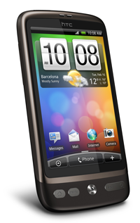
now I’m one of those people doing the train, tube, hammersmith, broad street, bishopsgate, liverpool street, tesco thing, I thought I really should get some kind of proper phone which lets me monitor trades on an AMOLED screen or something. or at least doesn’t hang for a full minute when I send a text. since I also have a tendency to avoid technology trends (meaning, usually, I can’t afford to be an early adopter), I had, a long time ago, discounted an iphone. actually, I like iphones, but anything that requires me to use bloody itunes just doesn’t make it onto any list I have. apart from the list of things I won’t buy that I have. and, since I’m already a google person, I was already looking for a phone built around a mobile platform that integrates all my googlist activities which of course is the moble platform that google make. it was really just a question of handsets and platform versions. which, granted, isn’t an insignificant consideration. suffice to say, after I’d bought a pile of ‘what mobile’ magazines the size of a small child and reviewed acres of adverts with the occasional technology blog in the middle, I’d determined that the HTC Desire with Android 2.1 was the very thing. which it is.
I really rather like Android. I really rather like HTC’s Sense UI, although it really doesn’t do an awful lot after you’ve worked out you don’t need to flip between 7 home screens that often. and I really rather like the Desire, even though its a bit, well, brown. all three together, notwithstanding the usual caveats around battery life, seem to support an all-round user experience that suits the way I want and need to use my smartphone to do the things I bought it for. my most basic requirement was for excellent support for multiple email accounts that exist on multiple servers. I was also looking for excellent social network integration. I was also looking for excellent clocks. truth is, limited as the Android apps store is, there’s just enough there to enhance the user experience by one or two degrees. mind you, the apps bundled in 2.1 and the google support built-in, means that I’m pretty well set up without needing to go anywhere near the app store. unless I want better clocks. for which there is probably an app. called ‘better clocks’.
in a nutshell, which is kind of what my new phone reminds me of, first impressions of the Android user experience on the HTC Desire are very favourable. I’ve had a week to do the thing where you turn everything on and then turn everything off again. I’ve tried all combinations of widgets, programs and shortcuts. and turned them all off again. I been through every single setting screen and religiously observed the state and behavioural changes that occur as a result and determined whether I like those changes. I’ve settled on a default configuration for everything. I’ve installed the advanced task manager to kill everything I’ve left running, because, excellent as multitasking is and nice as it is to have updates and notifications going of all over the place all the time, is does rather reduce the usable uptime.
next step is to work out how I might begin to design and build something that runs on my own phone, just to go through the development process. with all that spare time I have. I’m writing this on the train you know. and my tea’s gone cold.
if that title means anything at all. I’m quite pleased with it, but I suspect I just completely made it up, but then I suspect Jakob Nielsen completely makes things up sometimes.
as I’m constructing multi-state wireframes for a client, we’re uncovering all sorts of user expectations that we simply hadn’t considered when we started. which is nice. we also uncovering lots of interaction issues that we didn’t know we’d have because we didn’t really know what components we’d be using. which is also nice. more interestingly, we’re finding that we’re discovering some assumptions about behaviours are not correct and that is being uncovered by the made-up data I’m cramming into the wireframes to illustrate real-life scenarios.
in previous wireframe specifications I’ve completely abstracted the data into ‘item 1’, ‘attribute 1’, ‘attribute 2’ and ‘metadata x’ type labels, which do make your wireframes very neat, which I do rather like, but don’t adequately convey to the client just what they might expect to see at a particular component or object level, in a particular state. I don’t know all the data attributes in a complex trading system, of which there probably thousands, but I do know at least the highest few levels of the taxonomy that enable me to make reasonable assumptions about what is a meaningful and relevant set of data for a given object in a given state. so I’m throwing a few of them into the wireframes to illustrate state changes and assess user expectations.
while I was thinking this would be useful to demonstrate real-life application states, I was really using it as a device to increase the comfort level of the clients, by enabling them to make the subtle change in situational awareness from abstract to operational, which sounds like a grand statement, because it is. I tried to make it sound more like a joke, but I couldn’t work out how do do that and still make the point, which I’m now veering from. what it actually uncovered is that the assumption I’d made about some of the metadata that might be attached to a particular item was, in fact, not quite correct. that’s not to say it wasn’t correct metadata, it just wasn’t the metadata that users would actually find as useful as other metadata. which is fine. that’s why I sit with the clients and clarify their expectations. but the net result is much more than just me going back over 17 pages of visio layers and multi-clicking into shape groups to select the attribute text.
the subtle difference in the choice of metadata that is meaningful at that particular state of a particular application panel didn’t just change the label, it changed the whole focus of a subset of user interactions. what we had assumed might be a focus on creation date of an object, was actually much more about the distribution of that object, meaning that we’re not tracking the object by time, but tracking it by recipient. its not when, its who. and when that change is extrapolated across functional areas such an entry points to searches, reporting, and at a more granular level, iconography and semantics around context and labelling, it changes much more than just shape 97.
so its as well that I used that real data, even if I just made it up. ‘attribute 1’ just wouldn’t have prompted the discussion. I mean, I’d be finished by now, but we’d be building something inherently broken. like my computer. which is a different story.
Since I recently got my hands on my new Sony A500, I’ve hardly used it, which, considering that throughout 2009 I used my Sony A300 every day as part of my 365 project, amongst other things, is a bit of a calamity. I’ve not fallen out of love with photography, I’ve just fallen into a bit of a life change which makes it more and more difficult to spend any time doing anything outside what I really need to do. To be honest, for the last few years, I’ve had the relative luxury of working from home permanently, which enables you to do things like extending your lunch hour everso slightly or taking rather longer to get home after a school run, i.e. via Mousehold Heath or Westlegate. Now, however, I’m travelling more than 5 hours a day, and everything else stacks up until the weekend, so there is very little time to take to use creatively either with a camera, or with photoshop, which, incidentally is on the computer which has been broken for a number of weeks. I’m sure I’ll get back to it when there’s some kind of pattern to things, but until then, I’m afraid my camera sits in its little bag, in its little draw in the office in which I no longer sit, pining to go out. A bit like a dog, which, coicidentally, I’m getting soon, just to make sure any time I have is completely filled, although, on the plus side, I will undoubtedly have to to take lots of photos of it, notwithstanding the fact that, on the minus side, I’ll turn into one of those photographers who only takes photos of their pets, which, actually night be preferable to only taking pictures of myself.
I’ve not even got a recent photo to add to this entry, and, since I’m writing this on a train while it’s still dark outside, I don’t have any access to my own archives, so goodness only knows what I’ll stick in here when I get to work and look up my stuff on flickr which I’m not really supposed to do. I expect being a photographer full time is a bit like not being a photographer full time. You can’t get to things you really want to do because of the things you really have to do, but, at least if you’re doing product shots, weddings, pet shops, or calendars or something, you’re still extending your photography skills, even if you don’t like the creative output. Actually, that’s probably worse than not taking photos at all.