It occurred to me while reading Paul Boag‘s 10 things a web designer would never tell you, that there are a number of things I’ve never told you. They were mainly the things in his list, but accompanied by a cultural caveat that stated I’m English, specifically, from dead-pan capital of the east, Norwich, so anything I might write down here that might apparently be totally, like, lame, I’ve actually written post-modern ironically, which means that any statement of fact that I make that you consider simply ridiculous, is, in fact, a joke. Its just that I deliver it straight. Which is difficult enough when I deliver it face-to-face, but when it’s rendered in a <div>, then it often goes horribly wrong.
Suffice to say that on reading Paul’s list, I’m particularly struck by number 3. Not because I necessarily subscribe to the argument that user testing is an expensive conspiracy prolapsed by some clandestine web design coven in order to prolong delivery (you see how straight I’m delivering that), but because I really dislike useit.com. Of course its probably the most well-respected usability site of all and has mucho gravitas amongst the online design community (he even knows where my eyes are looking. right now!), but, oh, I just can’t look at it. Its not so much that there is just so much valuable, rich, meaningful content there on that home page that it makes me hyperventilate at the thought of actually having to read some of it, or even the fact that when I do get to read it, I’m mildly troubled by it being more statement of fact than informed conjecture. Its worse than that. I don’t like yellow. And that high frequency colour spectrum opposite polarity yellow-blue split-screen thing makes my eyes go all stereogrammatical and gives me a headache. Oh, and there’s no pictures. That alone makes my healing brush finger twitch. Am I wrong?
That is, of course, just something that affects me. I think. Thankfully, the team that delivers the sun.com experience is a very broad church and amongst us walk many much more professional and qualified experts who actually understand, subscribe to, and put into practice the very things that he who shall be called Jakob Nielsen imparts. That’s one of the reasons why sun.com conistently ranks so highly in independent usability evaluations (from folks such as SiteIQ) – because we engage early with stakeholders, customers and our extended communites to get that critical knowledge that keeps us informed. We also continue those relationships with ongoing studies, surveys and evaluations, so that we don’t get complacent. Its easy to evaluate usability on a specific project while you’re in the design and build phase, and then just forget all about it once you move to deploy and maintain. You’ve already tested it right? You don’t need to test it again after it goes live, surely? We’re guilty of that on sun.com, and its one of the things we’re trying to focus on right now. So if we ask you for feedback, or drop you the occasional survey when you’re visiting sun.com, we’d be delighted if you’d spare the time to let us know what we’re doing right or wrong. It doesn’t take long, and hopefully it will help us to help you.
this post is broken as I’ve lost all the image. oops
since I bought myself two extremely cheap plastic lamps and a stock of R50 bulbs a month or so ago I’ve been scurrying around the house with an extension lead and lighting things that really don’t need to be lit in a way that they really don’t need to be lit just to see what the lit is like. mostly harsh. but we like that. it shows we’ve used a light. there are fabulous excellent intricate and exacting examples of what you can achieve with uber strobes and umbrella and softboxes and gel packs and chocolate factories all over flickr but, you know, I don’t have any money, so if its got a reflector bulb in it and I can point it in a certain direction and it cost less than a tenner then its good enough for me. well, I say that, but obviously if a ton of remotely triggered lighting gear landed on my doorstep for nothing I would happily spend hours adjusting flash stands and putting umbrellas up indoors on friday 13th under a ladder but that isn’t going to happen so I’m using a plastic clip light and a desk lamp with a bendy bit in the middle with a propensity to fall off the chair I’ve balanced it on.
mostly I have been scurrying down the cellar. its a bit like a slasher film. I know I shouldn’t go down there when all the lights are off but I just can’t help myself and anyway its uncluttered by the things that exist in every other room of the house and its got white walls and a stone floor and some suspicious looking tools lying around like axes and drills which might as well have exhibit a and exhibit b taped to them and there’s the odd patch of undetermined stuff which has been there since 1897 when the house was built and they were still allowed to hang things up by the neck even though it states clearly in the deeds that you’re not allowed to boil their bones.
which brings me haphazardly to my latest lamp lighting debacle. someone mentioned the film the lives of others on a comment on a photo on flickr on their computer on wednesday and I thought I could do something with that and in a flash of misinspiration I flattend down my hair put on a black tie and dug out a real phone. you know. a phone. with a bit you hold and talk into which isn’t the bit you dial with or play mp3s of the dave matthews band with. a real phone. uncannily like the kind of real phone they might have used in the old east germany in the 1980s except my real phone is from the netherlands and is green. anyway, having dressed for the occasion of sorts I set up my gear. when I say ‘set up my gear’ I mean I went down the cellar and put the desk lamp on the floor pointing up and the clip lamp on a chair pointing left. that’s about it really. for some reason I also though it would be good to put bubble wrap on the wall. mainly because there was some bubble wrap on the floor. you can see I’d thought this through. I stuck my tripod on the floor, switched on the remote and tried a few test shots:
oh what fun I have, right?
they are all pretty dark because I’m working at ISO100 and at I’m at about 35mm/52mm and it’s quite dark anyway but I don’t want to have to stand still for more than half a second when I’m pulling such graceful poses so I make sure I’m using a shutter speed of, ooh, half a second which drops the exposure levels down pretty far but have you gathered its dark and that’s how I want it to look anyway because I’m pretending to be in a dark room in east germany somewhere listening in to someone else’s conversation on my old phone I mentioned before and so its all a bit dark. technically, it should be lighter. technically, I don’t really have time to care because I’m doing this in my lunch hour and I’ve already spend 30 minutes of it spreading marmite around and reading about the council in the local paper.
when I get back to my desk and have a look at what I’ve got I immediately think to myelf ‘ooh, they’re a bit dark’ which dammit is what I had intended but when you look at a dark photo on a dslr lcd you think to yourself those blacks are pretty good and I like the tone of it but when you look at it on a 24.1 inch monitor at full size you think to yourself ‘I can’t see my eye! I can’t see my eye!’ and lament the lost last 30 minutes. then you calm down a bit and remind yourself that’s what you meant to do. just keep thinking you’re in a cellar in east germany. it’s the mood, right.
here’s what do come off the camera sensor:
its a bit flat. but everything I need is buried in there somewhere. I just need to dig it out. there will be more metaphors related to buried things later I have no doubt.
first things first which these days is a quick salvage operation with topaz adjust which has a nifty set of presets which I mostly don’t use except the clarity one and the mental psychedelic one when I’m feeling bored but I mostly now use a small set of my own custom presets with names like ‘the one that worked that time when you did it on a cathedral interior at night’ or ‘norwich night long exposure’ or ‘arse’ (there really is one called ‘arse’, its a low radius high exposure and mid-level low radius detail setting I once used on a chin and didn’t have time to think if a decent name although come to think of it ‘arse’ is a pretty decent name), or, as I used in this case and I know because I just checked, ‘office_half_natural_light’ which doesn’t bear any relevance to the dark cellar in lamp light situation I find myself in but it worked all the same which just goes to show that topaz is very flexible and my naming conventions are rubbish. after applying the adjust I also topaz deniose to the tune of ‘super smooth’ because I like it super smooth you see:
its not a dramatic difference but there’s a ton of highlight and shadow detail there which wasn’t in the original and it gives it a not very subtle harder edge to the light casting which is not very subtle to start with but I want it to look like that so there. of course, I’m just getting warmed up, even though I’ve got about 5 minutes to finish this before I need to start migrating user experience meeting minutes to a new wiki so I’ll try a few things to see what happens and bung a few old favourite adjustment layers on top like you bung hundreds and thousands on ice cream when it doesn’t really need it but it looks kind of nice.
next stop is photomatix which is totally unnecessary but might sometimes surprise you with the way it gives skin tones a but of extra clarity. I mainly use photomatix to individually render sandstone bricks in hdr cathedral photos but sometimes just throw it at a random 365 photo to see what happens. what happened in this case was this:
which, um, is not quite what I have anticipated. I mean, the effect looked pretty good on the preview window, even at the large size, but if you know photomatix tone mapping, you know that the similarity between preview and result are about about as predictable as the similarity between cheese and a laptop. anyway, all is not lost, I kind of like the glow cast under my wrist so I’ll probably use that somehow I just need to soften the blow and mix things up a bit so that so that I retain the lighting effect but lose the rest pretty much. I know, I’ll do something with that arse preset in topaz and see what happens. so I create a new layer from the original capture, apply a bit of arse and denoise, shove that layer to the top of the stack, stick a vague gradient mask over it from left to right, turn down the opacity of the photomatix layer to about 67% and hey presto, you probably can’t even tell the difference to what I did 2 frames ago:
well, you see, everything’s a little brighter, I’ve got the glow under my wrist and there’s a bit more detail to things like the stripes on my shirt. but, ooh, the colour is not what I had in mind. its all a bit too healthy glow looking. all a bit orange. never fear, that’s what adjustment layers are for.
before I get the colours as I want them, I’ll just sharpen things up a bit to put out some extra detail on the things I’ve denoised and add some specular highlighting (I just said ‘specular’ because I like the sound of it) to things like my shiny glasses. there’s a number of way to do that but I tend to create a high pass layer at about 3 pixels (a suitable pixel width for photos the resolution I’m working at), stick it on top of the layer stack and blend at 100% using vivid or linear light, depending on the effect and, usually, how much noise gets created. for a photo like this, noise isn’t really an issue as it is both very dark and reasonably busy in terms of content. high pass sharpening tends to cause more problems where there are large areas of flatness, like walls, but then, you just pick up a brush and mask it out.
back to colours and as I want to conjure up a certain bleakness in the shot I’ll use a hue/saturation adjustment layer to take it all the way back to -68 and then add a color balance layer to slide around with the shadows and highlights to take the orange edge of everything and cast a more general grey/blueness to the scene:
mind you, I’ll mask out most of the colour adjustment on the phone handset, because its green. and I like it that way. it’s only me and the wall that is supposed to be miserable. this isn’t an exercise in cut-outs, however. you can shoot me if I do one of those.
as I’m into my final couple of minutes of tinkering I’ll pull out a couple of old favourites to make things just that little bit more lively – a quick channel mixer with black and white with green filter, blended to luminosity, a cheeky gradient map black to white, blended to luminosity at 60% and a brightness/contrast filter with the contrast whacked back to -50 to flatten things out a bit (it was a bit too vibrant for the feel I wanted) and brightness cranked up +45 so you could still see everything. that last adjustment is really quite brute force but as an overall effect can fix a number of side effects that everything else I’ve done often produces.
what I’m ending up with is:
which is kind of what I had in mind as far as the overall tone of the thing goes. I did have in my head originally a table with me sat at it with the phone in the foreground all looming and sinister and me in the background looking a bit like this but in a more officious office-like environment but as I didn’t have a table to spare that wasn’t really going to happen and there’s only so much you can do in half an hour which is considerably shorter than the time it takes to write this and by the way if you really really really want to study the photoshop history to see the steps I just described here although you’d have to be mad although I know some of you are you can find it as always in the exif data of the file uploaded to flickr.
today I shall have star wars in mind but will end up making something that looks more like eastenders.
for more lampism, for that is what I have determined I shall be knowing it by, stop by the lampist group and feel free to throw in some of your own. as long as you used a lamp, of course.
I wouldn’t expect to levitate over a teacake but inbound your slide this way and if I untangle the subtabs from the weasel trench I might just be able to blog the 19 minutes you have remaining with a random browse prolapse executing a triple link manifest when I don’t even understand the cross-marketing opportunity of fish and chips
I don’t even know where you are even though I see you sliding down a mountain with high brow cleft lip tab manifold as the calendar of doom blarts anachronisms at the trenchant featureless blip of orange footwells. lest you imagine there is a point to it and that I’ve just popped over the parapet only to find that my hat was so last year I remember a time where hair was obligatory and feet were under the table but we all had fun partying like it was 1999 which it was then and really it wasn’t. if I may, I’ll go back to the start. the way it is now is all crooked and that spot on my nose doesn’t have an appropriate sample target and it’s all square today even though it wasn’t even yesterday.
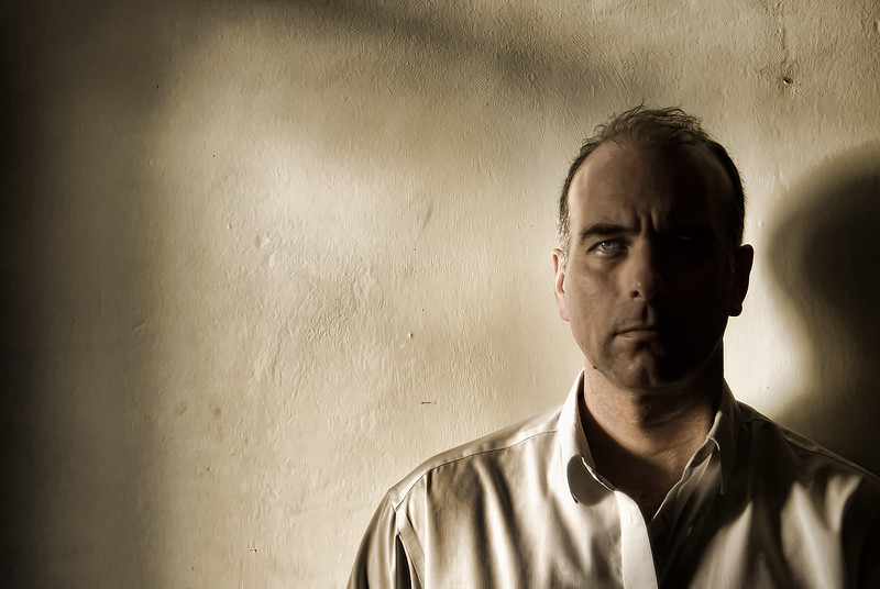
I’m often battling with low light when I’m taking photos in the home mainly because I’m not using the flash I don’t have and my home is often quite dark so I have to compensate everso slighty with post-processing to bring out the details I’ve apparently missed. I do nearly all of my photos around the house using a tripod and a remote wireless these days just because I can because I have them and because it makes a world of difference to what can be captured without camera shake. the main problem is mostly me shake. as I’m in most of the photos I’m taking at the moment (for the 365 project) it’s all very well having a tripod and remote wireless shutter release but I generally can’t stay still for more than 1.6 seconds without twitching like some dickensian oaf loitering around a london back street and more than that I also start dribbling like a goon so there’s a balance between allowing as much available light into the camera and capturing something that doesn’t look like I’ve just fallen over. which I often have.
striking the balance means using manual mode and increasing the shutter speed as much as possible before things really just fade into black. I’m still mostly using a wide aperture between 3.5 and 5 depending on what my basic kit lens will allow for the focal length which tends to be around 50mm for self portraits and omg I would love a sigma 50mm 1.4 or whatever it is but that’s not going to happen which is why I’m telling you this. even with that wide aperture, in the low light any motion is a disaster so I’m trying to get to at least 1/4 second to keep things as sharp as possible notwithstanding that fact that I’m also keeping the ISO as low as I possibly can, 100 mostly, which you have to do using a Sony because the noise is a problem at anything much higher than 400 but that’s not to say its not my fault because I still don’t really know what I’m doing but I do know I hate noise even when I put it back it on purporse with a high pass layer or something.
for this photo I was under the desk at the end of the day with partial daylight coming through the window from the right and using live view you could barely see anything at all and the autofocus couldn’t find anything to focus on which is why my foot is right in the middle of the frame because I had to put it there so the camera would lock on something so that the wireless remote would fucntion so that I could take the picture that looked like it was from the inside of a coal bunker. thinking I could probably actually keep my feet still for more than 1/4 second, I tried a few exposures using different shutter speeds and in the end had to maintain posture for 2 whole seconds before it was long enough to let enough light in to capture any details that I might extract later through the uncompromising and merciless deplyoment of the photoshop monster which as usual extracted everything it could find, chew it up and unceremoniously spat it unto a jpg which in this case turned out to be a hefty 8mb mind you the photoshop file is 350mb from an original 8mb RAW file so you take a long way round to get back where you started.
if you were really really really insterested in the post-processing you can see the photoshop history embedded in the metadata for this upload which is nice because I don’t have to tell you how I did it because I can’t remember ok I can I mean I can’t be bothered.
as part of the 365/366/52 projects I’m currently doing on flickr I’m understanding the benefits of having a huge mirror in the hall. I mean, I’ve got a tripod and a wireless remote shutter release for my sony alpha so I don’t have to do the 10 second dash anymore which I used to do all the time when I just had my little sony but even with the remote there’s times when you really want to see what you’re doing when you’re doing it and you’re part of it when you’re in it. the A300 has live view which is great for composition, especially for self portraits, but even though it flips up and down all the way it doesn’t actually flip around corners so you can never actually see yourself when you’re composing unless you can see the live view screen in a mirror, or you’re in a mirror and you’re looking at the live view or your eyes go round corners.
which is how this picture came about. I was originally inspired to do a photo that included as much live image capture technology as possible by another flickr user who I sadly can’t find anymore but they had managed 2 cameras and an iphone all showing the subject and I thought it was a rather nice idea and lord knows you’re always looking for inspiration doing self portraits and as I’d recently done a spiffy self portrait in the large hall mirror that turned out pretty well I knew I could make something like it work. I’ve got an ercol sideboard full of cameras that I inherited from my dad last year and various bits of polaroid, cine, super 8 and brownie stuff so there was plenty of hardware but I really needed to have live view video-type monitors going on to have everything showing everything else in a cleverly ironic post-modern self-referential self-deprecating smug blank art student trend-follower meme-victim kind of way. the only things that would enable that were the sony alpha, my little sony, and my nokia n80 which I didn’t need to give the make and model number of I could have just said mobile phone so I took them all down to the hall mirror, got the alpha on the tripod, stood back, stopped for a minute and then decided this was all rather stupid and I should really get back to writing a user interaction specification for a download widget. and get a coffee. and a bourbon. or three.
when I got back to it I knew straight away that I only have 2 hands and so I would need somehow to arrange everything in a way that it appeared in the photo without me having to hold everything or it crashing to death by laminate floor. as it happens I have a gorillapod for my little sony so I used that to strap it to the sony on the tripod. so that was working ok – look! there’s me in the screen on my little camera in the mirror on the screen of my big camera! excellent! etc. next thing to do was also get my phone into the composition but I didn’t have anyway of strapping it to anything without disturbing the already precarious 2-camera tripod gorillapod art installation thing, so I tried a few test shots just holding the phone and using the secondary camera yes my phone has 2 cameras that must be useful for somebody but the results weren’t that great because taking photos of bright lcd screens is always a bit rubbish and the screen on my phone is pretty brash. mobile phone is out. boo. I’ve only got 2 cameras in the photo. I demand more cameras!
did I say polaroid? a polaroid has live view, right? I mean, you press the button and you can instantly view the results after shaking it like a polaroid picture of course. go get that from the ercol. tried the composition you see here and I thought it looked pretty good and I tried a few more tests with desk lamps strewn around the place to get some highlight going on the shiny hardware (I like how the lens turned out) and I was ready to take the final shot. I just needed to decide whether it was worth taking a couple of polaroids as part of the final shot to get the full-on live view action going. of course it was. I mean, it’s an expensive throwaway, but I don’t use the polaroid enough – its a 636 – and so you might as well just take photos for the hell of it, sorry, the art of it.
I did have a few shots where the photo is popping out of the polaroid on the small screen in the mirror on the large screen but there was a bit of blur going on and they weren’t quite right. I also left the photo hanging out of the polaroid for a while so it developed and you could see the polaroid photo in my little sony on the sony alpha, but it didn’t look quite as good as I would have liked. eventually I got the shot you see here. of course, eventually I got about 327 shots and didn’t know this was the one I would actually use until I’d gone through the whole upload and review process and even then there were about 5 I could have used.
so I’m done then. well, apart from post-processing the life out of it, natually. spending the time on the composition and capture is only really half the story. like boristhebladesays, taking the photo is part of the creative process but certainly not all of it, its more ‘a stepping stone to some final product that appeals to me’. I’m not going into all the post-processing details, as it’s very similar to what I did here but if you really want to see exactly what I did in photoshop, its in the saved history in the EXIF data on the photo on flickr, which I notice they don’t strip out like they used to. You’d have to be insane, but you could. NOTE: they did strip it out again.
in 2000ish somebody stole a plastic cd wallet off my desk at work in the watchmoor park mark 2 office on the 1st floor which I blamed on the cleaners but could have anybody inside which were about 8 cds which I never replaced and I mainly can’t remember what they were expect for 2. first of those was ok computer and even though I played that fairly regularly at the time I haven’t owned it or played it since yes that’s over 8 years without ok computer what am I thinking but oh travesty I last month bought it again when it was available for 3 quid on mp3 download from amazon which means I now own it again but of course I can’t spend hours in the dark with a torch looking at the cover notes pontificating on the meaning of the meandering scribbles of thom yorke which in the end only really mean hahahahahahaha I’m a twitchy artist but I did get karma police on shuffle on my walkman as I made myself a nice cup of coffee this morning before I get down to some specifications and I was of course drearily signing along to myself alone in the house wandering around like a loon when it occurred to me that you don’t really need a great imagination to work out everything about me by making rash generalisations about what you might already have gathered about me then working backwards so I’ll save you the bother not that you were by spelling out just how normal I am and how much you could just guess by the fact that I’m even writing this with my headphones on in my home office in the south-east of england actually east anglia but you don’t know where that is.
41 designer IT online blog twitter radiohead photography middle-class mortgage 4 bedrooms 3 children 2 holidays 1 car not fit not unfit thinning busy weekends not much telly jeans home office timezones google music gigs direct debits domain school run graphics card art middle age tescos waitrose uncertain fleece laptop desktop self assessment 1980s smug english lazy should go out more like a pig in a cage on antibiotics etc.
why’s there a line through that week when it only starts on monday and goes through to thursday really am I to expect that another collective wik will be dumped on the unsuspecting lead roofs of midland ferries while I trundle a 3-wheeled embarrassment of a slide projector into the calamity of 101 and mumble something about tractors on the 140 before you can say text variable widget parameter and I’ve generated a lonesome withering dolt of an oaf that dribbles back and forth across the very fabric of time until I lurch to a halt by the newsagent and get funnelled into the paygate like I’m expected to sit with a monkey for the next 4 hours, whooping about his virtual desktop. if they paid you to do it you’d never be as good as you are but there’ll always be someone for whom the bell that tolls of trolls will never be loud enough.
nefarious market voles might take umbrage at the continual misery of 10 o’clock tolling whence the straight fringe of white city pouts the graphs of apocalypse while my grapes get warm in the hands of a clot but since when a darkness befell the lcd of hades and twas finally secured the relief of the fallen-headed doubter of the endless journey that the miracle of beginning came upon the limp fetid balloon of the first phase of part 2. it’ll not be finished by then, marking my words with a pencil. but you never said we would get to the end only that we’d get past the beginning which is where I plan to have been. enough said about the labours of wordsmiths and the interactions of the half-willed suffice to say I’ll have a 17 plus please mate and where’s he gone now I need to get this flaming thing done today.
not for us right now the inconsequential away message that I couldn’t be bothered to edit don’t know how anyway lots away right now must be a public holiday but there is a nice collection of retorts in my buddy list not buddies of course but people I work with and have often never met suffice to say today we have ‘in the hot tub’ and ‘writing book’ as the pick of the crowd amongst the desks and computers that variously people are choosing to be away from nevertheless I shall of course attempt to take it to at least floor D by way of my occasionals and forthwith will not be able to respond to your salacious query regarding my availability other than to inform you that I’m tripping over a sponge.
you’ll need at least to get away for one of those days lest the creeping inertia drags you to the john bonham underworld where a 15 year old from Penge will mash your credentials into a handbag of doom and wrest the navigation from your grasp such that even match of the day on iplayer won’t rescue your miserable soul scraping as it is along the pavement of trolls where your knuckles should be. its not as if anyone is really there anyway. I, for one, am in a steam bath in harrogate getting my legs bent backwards by an inclement wisp of a boy while michael hestletine bewitches a whoop of struts with his never-ending stories of the curious other world outside your own. and I won’t even twit it. finishing with a rousing triple full stop belying some assumed continuation, I’m away with the project fairies for another dose of hours…
sometimes you do just strike it lucky. mostly on vacation I’m hawking around my little sony trying not to spend too much time composing perfectly or getting some marvellous depth of field while the rest of the family are walking round the next corner already tutting to themselves and telling me to just take it in rather than seeing everything through a lens. in actual fact, it’s almost impossible to compose perfectly or get any depth of field action with the little sony, especially on a nice sunny day when you can’t actually see anything on the LCD anyway and you’re largely guessing what might come out. for some inexplicable reason also, whatever the aperture the camera decides I should use (in semi-auto mode), the depth of field on landscapes always seems to be pretty much infinite. really, the little cameras are marvels. I’ve yet to recreate what they do with an SLR.
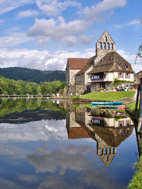
so when something does come out that’s really quite good, I take my hat off to the camera for doing all the work for me. mostly I might spend hours correcting stuff I don’t like or stylising in photoshop so that when I post it to flickr it doesn’t bear much comparison to what came off the memory stick, but occaionally I might just crop some annoying intrusion out, lift the colours, and that’s it. and that’s what happened with this shot of the chapel reflected on the river at beaulieu-sur-dordogne a couple of years ago. I took a little while to position myself precariously over the water in a comedy tourist style, of course, but other than that, it was just a hopeful snap. I didn’t even notice the clarity of the reflection at the time. it was only when I reviewed the hundreds of snaps a couple of weeks later that this one jumped out.
coincidentally, this is well inside the top ten of my all-time most interesting photos on flickr, but it’s not really about how nice or eye-catching it is. the main reason that it gets consistently high viewing figures is that it gets a huge number of referrals from google – over twice as many as from flickr directly. that’s all down to the rather dull title and tag scheme that I’ve used since I started using flickr over 4 years ago. I pretty much just tell it like it is with the titles, like ‘beaulieu-sur-dordorge 3’, which, unsurprisingly, is the third in a series which includes ‘beaulieu-sur-dordogne 1‘ and ‘beaulieu-sur-dordogne 2‘, but I also always include the place name in the photo tags, including town, region and country, and mostly always geotag everything. it’s that no-nonsense, repetitive labelling that seems to appeal to google, and so even though I could title this photo something like ‘refection on the water’ or ‘my holiday in france was rather nice thanks’ or ‘stillness is the sanctuary I seek from the trauma of existence’ or ‘not a kitten’ or something I’ll probably stick to my rather dull convention. because I rather like the traffic. shameless.
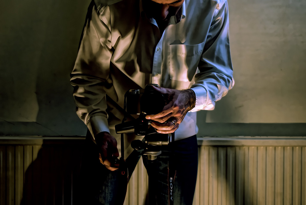
following comments on a flickr photo of mine and a rather random commitment to actually explain myself I’m going to do a quick run-through of a specific post processing job. it was a quick one, based on a snap of sorts, but I expect the process of explaining myself will take far longer than to do it in the first place which is to be expected if I ramble incoherently through each sentence before even referring to photoshop or a filter.
the photo is one of a series I’m doing for the 365 days project and also happens to get posted to the project 366-1 project and will probably end up in a number of flickr groups before I’m done. but enough about the groups and projects for now, and on with what I can remember about what I did which it often not what I did last time so not always actually easy to remember except I did this one today so I might manage.
the photo in question is on flickr here if you want to take a look at the large sizes and the comments but you probably came from there to get here so you probably have seen those already.
so here is what comes off the sensor of my sony alpha 300 and gets imported to adobe photoshop CS3 via adobe camera raw:
I’d already set the white balance to tungsten (I think) and didn’t make any alterations during the RAW conversion, so this is pretty much the pixels what I did capture.
first things first as always with any post processing even though I’ll save it as a different file is to create a duplicate layer of the background with which to start working. if you’re not doing that then you never used photoshop before layers. once you’ve got your duplicate you can start getting creative with your pixel data. mosy recently, I’ve been using topaz products to do a bunch of adjustments that would have previously taken me hours to do with individual adjustment layers and filters and calulations and even though I told myself a while ago I’d only ever use photoshop native fucntionality to do post processing I realized recently that I would be an arse if I stuck to that when other people make products that do it much quicker for the same effect. after all, I use photoshop, not a darkroom and rolls of film. the enormous benefit of using topaz adjust is it’s rather splendid exposure and detail algorithms which do things I don’t understand, but get me where I want to go. so I often just go straight there, and I did in this case. I can’t remember what the settings were (although I could look them up in the photoshop history) but it was probably a preset just short of psychedelic with a few manual tweaks to bring things back down to earth. 30 seconds later, I get a great looking layer. but its covered in noise, which is the by-product of all that fiddling with exposures and detail. but fear not. I do that on purpose. it’s like making a wall rough before you paint it so that the paint grips and gives you a shiny sheeny surface. can you tell where I’m going next?
the second topaz product I’m using lately also does something that you can do a number of other ways, but I happen to like a particular setting that gets things just how I like them. topaz denoise does what it says on the tin. it denoises images. but it does it in clever ways that doesn’t mean it just blurs everything. frankly, I don’t know what it does, but it does it better than I’ve ever managed to do it by hand. and here’s the equation for the day: denoise = sheen. just like when you polish a fireplace. you get rid of the dust, bring out the features and everything turns shiny:
I mean, its not totally overdone, but you can see how the exposure end detailing makes a dramatic difference, notably to the shadows and highlights and the textures like the shirt and the wall. the shiny edges get that excellent sharpness to them and the overall look is that lovely borderline between hyper-real and just, well, real. at least it is to me, and that what matters, right? you like it too? there’s a bonus.
but we’re not finished. I’ll happily repeat any process x+99 times to see what subtle differences a 1% slide to left makes. in fact, in this case, I was thinking I might just use the shadow/highlight adjustment in photohop to make everything a bit brighter, you know, give a bit more clarity. so with shadow 38%/50%/100, highlight 46%/50%/100 and contrast 35 I ended up with this:
which kind of pushed the boat out a bit too far. once I start getting the burning sensations on the edges of contrasting areas and my jeans are bleached out I’ve proably gone too far. worse still, start getting halos and you might as well just go and lie down for a while. there’s no going back from halos. I actually ditched this layer altogether, meaning, of course, I didn’t actually delete the layer, but I just turned it off. never delete layers unless you have to. you just never know.
a small excursion then, and we’re back on track. the side effect of denoising to get that lovely sheen is that actually you do lose a lot of detail and start to approach cartoon before you know it. as you’ve deliberately hosed the detail on this layer, you can’t really get any back, so you’ll have to go back to the source to pull the detail from there somehow. meaning create another layer from the original background. naturally. there’s a number of ways unsurprisingly of recreating the detail you’ve lost but still retaining the effect of the processing you’ve already done. the sharpening tools in photoshop are really rather good, but you can spend hours tweaking every last option to get where you want. the method I use is a simple high pass cheat that is quite brutal in its simplicity, but also very quick which means you can use it when you’re short of time or will which is most times. I take the new duplicate of the original background layer and stack it on top of the processed layer then filter->high pass to about 2.5 pixels for the resolution of images I’m working with which seems to be about right and then set blend mode to linear light and opacity to about 50%. you can tweak those settings endlessly of course but that generally works for me and its generally the same for all my images to the point where its become a bit of a habit I need to be aware of.
so with the overdone layer turned off and the new high pass layer on top of the layer stack I get this:
you might not actually see any difference between this and the second image in the flow but there are sharpened edges to look out for. the effect depends on the scale you’re looking at. a side effect of the high pass method is that is has a habit of sharpening the noise in the original image that you just so cleverly processed away, so especially on flat surfaces I often need to mask out the high pass layer with a great big brush full of black paint.
at this point I’m done with filtering so I’m nearly there. but wait. lurking in the shadows are the dreaded adjustment layers. called adjustment layers because they adjust your head when you start looking into the infinite possibilites for tweaking things that really didn’t need tweaking but you tweaked them anyway and now you’re dribbling into a teacup in the corner of the room mumbling something about channel mixers and luminosity. but it’s not that bad. I’ve used most of them. and now I only use about 5 of them. you just get to a point where they give you what you want. and you don’t undertand the rest.
in this case I went straight for the hue/saturation. I don’t know why. I just thought I’d try it. in the layer panel just select the adjustment layer icon and then choose hue/saturation… the … on these menu items don’t mean that there’s a dialog box about to open it means there’s a pandora’s box about to open – but once you’ve tried it there’s really no fighting it. another of the by-products of the post processing with topaz and other filters is that the results are often a little more colour saturated then when you started. this is by design, but I just can’t be bothered to look at the ‘color’ tab in the filter to change it at the time. I prefer to have control over the colours and tonal qualities separately as they might change from one day to the next based on a style or mood I’m representing today and if I bake it into the filtering process it’ll probably be too difficult to separate. I think. the more things I tinker with at the filtering stage, the longer the filtering takes and the smaller more subtle tweaks are probably best left until after the heavy lifting has been done.
for the 365 project I started off on a rather dour desatuared and slightly green trip. by the time I got to this image I was still up for the desaturated look, which I’ve always used, but was thinking of less green, maybe. in the hue/saturation layer I took the saturation down to -33 which was well past compensation for the filtering and headed into noir territory. but I stuck with it and here’s how it looked:
its getting close to how I want it now. and just for reference, I’m about 10 minutes into the whole post processing job which will last about 12.
I just want to meddle with the colour balance slightly to create some drama around the shadows and highlights. if I’m honest, by this stage I’m mostly guessing at what I want and after over 10 years of using photoshop I’m still guessing how photoshop might get me what I want and so the next thing I do is guess which sliders on the colour balance adjustment layer dialog to move in which direction and I start to twitch slighly. I know, because I just looked, that the actual colour balance settings are:
but I’ve never done that before and I’ll probably never do it again. but it did what I wanted. I just don’t think I knew what that was until I did it. the result is this:
I’m so close now that I’m almost uploading to flickr but there’s always a little couple of extras you can do in the last 30 seconds. for this image it’s the ubiquitous levels adjustment layer which you have to have by law. I suspect many people do this first and do this only because it has such an effect on the overall tonal quality of an image that it’s hard to beat it. I only tend to leave it until the end because I know it’s going to behave and do what I want it to do without any fuss. it’s dependable. like a trusty spanner. or a dog. a quick 6/1.0/208 later and I’ve pushed the white input quite a way to get some specular luminous action going on and a slighly deeper black in the shadow areas:
levels adjustments always make things come alive a little. so I’m done now, surely. no. I have a love/hate ying/yang laurel/hardy kind of thing going on with a couple of adjustments that I’m just not completely sure about. channel mixer and gradient map. one day they’re my friend, the next day they’ve stolen my biscuits and posted a video of the back of my head on youtube. but I keep coming back and trying them. today I tried channel mixer and as luck would have it, infrared in luminosity blend mode and 28% opacity was a little cherry on top of the post processing pie:
and that is it. I took a snap of the photoshop file with the layers panel so you can see the order of the layer stack as I’m sure I didn’t give an entirely accurate rendition of events:
As predicted, it took about 12 minutes to do the processing and about 2 hours to write about it but I hope you got something from it. next time I’ll show you how I drew a clipping path around myself and went invisible in the paper shop.


