its all very well sitting there in your office pointing your camera at yourself and then painting shadows and highlights all over your face, but sometimes you might need to get out into the real world and turn your camera around to look through it, rather than looking at it. and what better place to do that than in a place where you are surrounded by lots of shiny new architecture like the new terminal 5 building at Heathrow airport where there is the most shiniest and most enormous bits of architecture I’ve come across recently. I mean, I rather like big shiny bits of architecture with walls of glass and unfeasably large skeletons, but there are only so many times you can stand in front of the Forum in Norwich getting the reflection of St Peter Mancroft over someone from the BBC eating dough balls with a Chianti at lunchtime.
one of the reasons I like photographing big architecture, especially modern, Richard Rogers style architecture, is that it often lends itself very well to post-processing of the style you might inadvertently call post-modern-urban-apocalyptic-galvanised, or, um, shiny. and that’s the kind of post-processing I like to do, most often with my own face, which, in its own way, is a kind of post-modern apocalypse anyway and is often quite shiny, but in general, works better with loads of glass. and metal. so when I was lucky enough to be British Airways-bound for Colorado via terminal 5, for a user experience summit with a twist, I wasn’t going to miss the chance to fill up my memory card with geometric shapes and reflections the size of Norfolk. in fact, I got there over 3 hours early, which, after a 4 hours National Express coach ride on the 727 is the minimum recovery time before a 9 hour journey in economy, armed with 2 cameras, a home-made sandwich, and the sun even came out. a bit.
the nice thing about terminal 5, it seems, is that you can actually take a dslr out and point it at things without fear of incarceration. the most interesting shots were to found on the outside of the building, landside, so probably not too much to worry about, but I was also able to wander freely within the terminal after security, airside, taking really rather pointless photos of concrete and aircraft noses and the occasional departure board. the most interesting bit, however, was the largest escalator I have ever seen, which transported down to the transit to take you from terminal a to terminal b. this wasn’t just a large escalator, this was an escalator with its own vanishing point and although I was unsuccessful in getting a perspective view down from top to bottom, or from bottom to top, that was worth using, I did catch some of it in this rather nice overlap of escalators, elevators, staircases, suspended walkways and other shiny stuff, just before heading to the transit. you can just about make out the people crammed into the glass elevator, which, right after I took this photo, crashed through the roof and landed in a chocolate factory.
incidentally, although I had meant it to be the point of what I was writing but as usual lapsed into something completely different. I used a number of things to process this photo, but it was a combination of Topaz, Photomatix, Photoshop adjustment filters and a fair amount of painting things with a brush, which I really need a tablet to do properly, and not the kind of tablet that gets rid of the headache I’m giving myself.
since Corie has started going out at night and taking lots of groovy hdr I was reminded that I kind of like doing those but can’t remember how because last time I did it it took ages even though I wrote all the steps down on a post-it note that I immediately misplaced. but I had a rummage around in my drawer that has all my photographic stuff in it – it’s a pretty small drawer – and lo, the post-it note was stuck to the underside of a digital slr photography magazine from last year sometime in which I could learn all about taking polarized macro photos of wet cdroms arranged under a snooted soft umbrella box or something.
unfortunately, I still had no idea what I was talking about. it was full of things like ‘PS HDR x3+ (d,m,l)‘ and ‘PM EB (3 PS HDR)‘ and the rather ambitious one liner ‘PS HDR 1/2/3 PM HDR PM EB 1/2 RAW‘, complete with a big bracket underneath which suggested I should put it all somewhere and then do something with a smart object, which, these days, I just get slightly queasy just thinking about on my 5-year-old computer. so I decided I’d go out and get some new bracketed exposures and just try and follow my own instructions to see how it would go. to make it even more of a nightmare to process, I figured I may as well make it a night shot. with trees in. or something. I initially headed out to the roof of Anglia Square car park, because I like car parks, but I’d miscalculated the sunset and golden hour (not the one with Simon Bates), and so I was up there far too early and the thought of spending another hour up there just waiting for the sun to set behind a knackered lift shaft and a ropey old street lamp didn’t really fill me with inspiration.
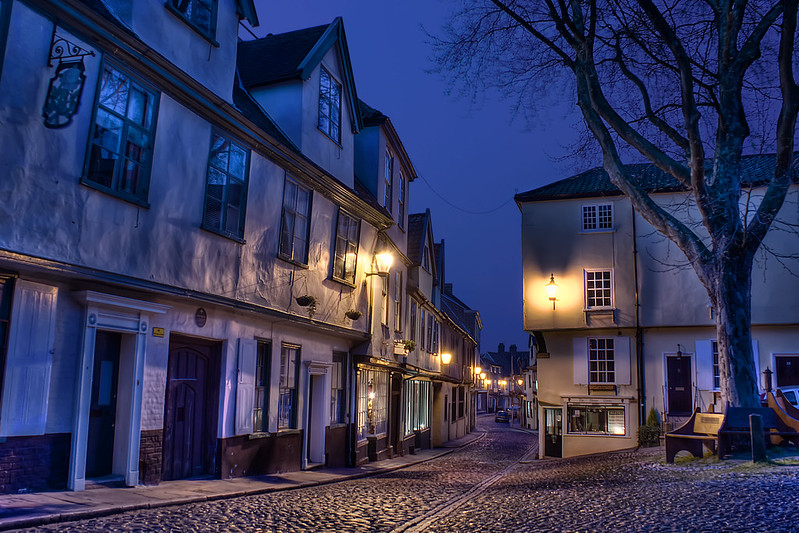
after a couple of circular arguments I had with myself about the relative merits of Tombland and the cathedral I actually ended up in the irresistable scab of Norwich photographers that is Elm Hill. I mean, you don’t want to keep ending up there, but you can’t help picking at it now and then. If you’ve not taken at least 15 shots there over the years that you hide away in a hidden folder that you think you might process one day, then you get arrested. In this case, it was just about the right time of day to get a number of exposures with various shades of dark blue in the sky, but still get some appreciative cast from the pretty low-key street lighting. or that’s what I though. but I don’t really know what I’m talking about. nonetheless, I set up my Manfrotto, waited a few minutes while people rather annoyingly thought they might go about their business, and then took my 12 manually bracketed exposures from black to white, just as the wind picked up and threw the tree around like the wispy hair of a 42-year-old amateur photographer. the last exposure was about 30 seconds, during which at least 3 people stopped in their tracks as they came around the corner and saw me standing with my wireless remote looking, plainly, a bit mad in the dark. on the way home, I took about 59 pictures of the market at night for good measure, then I went home, ate a sandwich, watched the Champion’s League, the Bourne Identity and the 50 greatest 50 greatest celebrity cheese breakdown soap advert scary war film love scenes, and that was that.
a few days later, I actually kicked the computer into action, and tried to follow the scribbled workflow process, just to see if it would make any sense at all. it slowly came back to me and I remembered some of the things that I got caught out with before (don’t overprocess the HDR conversion, don’t auto-align in photoshop, don’t auto-align in photomatix, don’t try and do it with smart objects, etc.) which took a while to rectify, but on the whole, the scribbly wibbly workflow turned out to be alright. of course, there was mucho to do with blending, masking, opacity and highlight/shadow painting, and as it was a night photo, actually undoing most of the processing was the biggest challenge, but to get to the point where all the fancy automated processes had done as much as they were going to do, the workflow worked fine. so much so that I wrote it out all over again. but with boxes and arrows and things. on a computer. I think its called a flow diagram, but I largely made it up. if you want to see how little sense it makes when you first look at it, take a look for yourself, and, if you’ve got the tools, or at least some of them, you might want to try it out. I just want somebody to go through it so I can laugh at them later.
there’s nothing really more appropriate to fill 10 minutes of your day than to lurch down to the cellar, point a desk lamp at your face as take photos of it. such a vicarious lampist thrill is surely the antidote to getting up at 5 in the morning and trudging out to the Norfolk Broads to catch the first sunrise over a wind pump as you drop your Sigma 10-20mm into the mud and watch your Manfrotto slowly sinking out of sight as a large bird picks up your Lowepro and whisks it off to Narnia. not that I’ve done that. I’m too busy mucking about with R50 bulbs and miniature skateboards to do photography all proper-like.
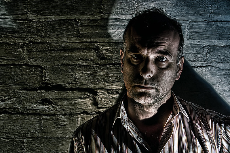
so to the latest arms-length clip-light lunchtime abberation in my growing collection of things you can do with an arm and a clip light and a camera, which pretty much serves as a template for how I’m doing this nonsense, both in the photo capture and the post-processing. its pretty much as I’ve described in the other low-light post-processing entries in this blog and lo, its the same wall, the same lamps, the same camera, the same time of day, the same face, the same photoshop, the same everything really. even the layers in the photoshop files look pretty much the same, except, of course, you wouldn’t know that, other than taking my word for it.
except this time. I can’t frankly be summon the will to tell you how I did it even if you were remotely interested which you’re probably not although you’re reading this so you at least were foolish enough to follow the link that says’ read about this’, so I’ve uploaded the photoshop file for you to poke around in, I’ve labelled it and everything. honestly, it was quicker to upload the file than it is to write about it. you can probably copy and paste your own head into it or something. you might like to know that its over 200mb before you think about downloading it, if you were. perhaps you just did. I tried zipping it to make it smaller, but it made it bigger.
I’m often battling with low light when I’m taking photos in the home mainly because I’m not using the flash I don’t have and my home is often quite dark so I have to compensate everso slighty with post-processing to bring out the details I’ve apparently missed. I do nearly all of my photos around the house using a tripod and a remote wireless these days just because I can because I have them and because it makes a world of difference to what can be captured without camera shake. the main problem is mostly me shake. as I’m in most of the photos I’m taking at the moment (for the 365 project) it’s all very well having a tripod and remote wireless shutter release but I generally can’t stay still for more than 1.6 seconds without twitching like some dickensian oaf loitering around a london back street and more than that I also start dribbling like a goon so there’s a balance between allowing as much available light into the camera and capturing something that doesn’t look like I’ve just fallen over. which I often have.
striking the balance means using manual mode and increasing the shutter speed as much as possible before things really just fade into black. I’m still mostly using a wide aperture between 3.5 and 5 depending on what my basic kit lens will allow for the focal length which tends to be around 50mm for self portraits and omg I would love a sigma 50mm 1.4 or whatever it is but that’s not going to happen which is why I’m telling you this. even with that wide aperture, in the low light any motion is a disaster so I’m trying to get to at least 1/4 second to keep things as sharp as possible notwithstanding that fact that I’m also keeping the ISO as low as I possibly can, 100 mostly, which you have to do using a Sony because the noise is a problem at anything much higher than 400 but that’s not to say its not my fault because I still don’t really know what I’m doing but I do know I hate noise even when I put it back it on purporse with a high pass layer or something.
for this photo I was under the desk at the end of the day with partial daylight coming through the window from the right and using live view you could barely see anything at all and the autofocus couldn’t find anything to focus on which is why my foot is right in the middle of the frame because I had to put it there so the camera would lock on something so that the wireless remote would fucntion so that I could take the picture that looked like it was from the inside of a coal bunker. thinking I could probably actually keep my feet still for more than 1/4 second, I tried a few exposures using different shutter speeds and in the end had to maintain posture for 2 whole seconds before it was long enough to let enough light in to capture any details that I might extract later through the uncompromising and merciless deplyoment of the photoshop monster which as usual extracted everything it could find, chew it up and unceremoniously spat it unto a jpg which in this case turned out to be a hefty 8mb mind you the photoshop file is 350mb from an original 8mb RAW file so you take a long way round to get back where you started.
if you were really really really insterested in the post-processing you can see the photoshop history embedded in the metadata for this upload which is nice because I don’t have to tell you how I did it because I can’t remember ok I can I mean I can’t be bothered.
following comments on a flickr photo of mine and a rather random commitment to actually explain myself I’m going to do a quick run-through of a specific post processing job. it was a quick one, based on a snap of sorts, but I expect the process of explaining myself will take far longer than to do it in the first place which is to be expected if I ramble incoherently through each sentence before even referring to photoshop or a filter.
the photo is one of a series I’m doing for the 365 days project and also happens to get posted to the project 366-1 project and will probably end up in a number of flickr groups before I’m done. but enough about the groups and projects for now, and on with what I can remember about what I did which it often not what I did last time so not always actually easy to remember except I did this one today so I might manage.
the photo in question is on flickr here if you want to take a look at the large sizes and the comments but you probably came from there to get here so you probably have seen those already.
so here is what comes off the sensor of my sony alpha 300 and gets imported to adobe photoshop CS3 via adobe camera raw:
I’d already set the white balance to tungsten (I think) and didn’t make any alterations during the RAW conversion, so this is pretty much the pixels what I did capture.
first things first as always with any post processing even though I’ll save it as a different file is to create a duplicate layer of the background with which to start working. if you’re not doing that then you never used photoshop before layers. once you’ve got your duplicate you can start getting creative with your pixel data. mosy recently, I’ve been using topaz products to do a bunch of adjustments that would have previously taken me hours to do with individual adjustment layers and filters and calulations and even though I told myself a while ago I’d only ever use photoshop native fucntionality to do post processing I realized recently that I would be an arse if I stuck to that when other people make products that do it much quicker for the same effect. after all, I use photoshop, not a darkroom and rolls of film. the enormous benefit of using topaz adjust is it’s rather splendid exposure and detail algorithms which do things I don’t understand, but get me where I want to go. so I often just go straight there, and I did in this case. I can’t remember what the settings were (although I could look them up in the photoshop history) but it was probably a preset just short of psychedelic with a few manual tweaks to bring things back down to earth. 30 seconds later, I get a great looking layer. but its covered in noise, which is the by-product of all that fiddling with exposures and detail. but fear not. I do that on purpose. it’s like making a wall rough before you paint it so that the paint grips and gives you a shiny sheeny surface. can you tell where I’m going next?
the second topaz product I’m using lately also does something that you can do a number of other ways, but I happen to like a particular setting that gets things just how I like them. topaz denoise does what it says on the tin. it denoises images. but it does it in clever ways that doesn’t mean it just blurs everything. frankly, I don’t know what it does, but it does it better than I’ve ever managed to do it by hand. and here’s the equation for the day: denoise = sheen. just like when you polish a fireplace. you get rid of the dust, bring out the features and everything turns shiny:
I mean, its not totally overdone, but you can see how the exposure end detailing makes a dramatic difference, notably to the shadows and highlights and the textures like the shirt and the wall. the shiny edges get that excellent sharpness to them and the overall look is that lovely borderline between hyper-real and just, well, real. at least it is to me, and that what matters, right? you like it too? there’s a bonus.
but we’re not finished. I’ll happily repeat any process x+99 times to see what subtle differences a 1% slide to left makes. in fact, in this case, I was thinking I might just use the shadow/highlight adjustment in photohop to make everything a bit brighter, you know, give a bit more clarity. so with shadow 38%/50%/100, highlight 46%/50%/100 and contrast 35 I ended up with this:
which kind of pushed the boat out a bit too far. once I start getting the burning sensations on the edges of contrasting areas and my jeans are bleached out I’ve proably gone too far. worse still, start getting halos and you might as well just go and lie down for a while. there’s no going back from halos. I actually ditched this layer altogether, meaning, of course, I didn’t actually delete the layer, but I just turned it off. never delete layers unless you have to. you just never know.
a small excursion then, and we’re back on track. the side effect of denoising to get that lovely sheen is that actually you do lose a lot of detail and start to approach cartoon before you know it. as you’ve deliberately hosed the detail on this layer, you can’t really get any back, so you’ll have to go back to the source to pull the detail from there somehow. meaning create another layer from the original background. naturally. there’s a number of ways unsurprisingly of recreating the detail you’ve lost but still retaining the effect of the processing you’ve already done. the sharpening tools in photoshop are really rather good, but you can spend hours tweaking every last option to get where you want. the method I use is a simple high pass cheat that is quite brutal in its simplicity, but also very quick which means you can use it when you’re short of time or will which is most times. I take the new duplicate of the original background layer and stack it on top of the processed layer then filter->high pass to about 2.5 pixels for the resolution of images I’m working with which seems to be about right and then set blend mode to linear light and opacity to about 50%. you can tweak those settings endlessly of course but that generally works for me and its generally the same for all my images to the point where its become a bit of a habit I need to be aware of.
so with the overdone layer turned off and the new high pass layer on top of the layer stack I get this:
you might not actually see any difference between this and the second image in the flow but there are sharpened edges to look out for. the effect depends on the scale you’re looking at. a side effect of the high pass method is that is has a habit of sharpening the noise in the original image that you just so cleverly processed away, so especially on flat surfaces I often need to mask out the high pass layer with a great big brush full of black paint.
at this point I’m done with filtering so I’m nearly there. but wait. lurking in the shadows are the dreaded adjustment layers. called adjustment layers because they adjust your head when you start looking into the infinite possibilites for tweaking things that really didn’t need tweaking but you tweaked them anyway and now you’re dribbling into a teacup in the corner of the room mumbling something about channel mixers and luminosity. but it’s not that bad. I’ve used most of them. and now I only use about 5 of them. you just get to a point where they give you what you want. and you don’t undertand the rest.
in this case I went straight for the hue/saturation. I don’t know why. I just thought I’d try it. in the layer panel just select the adjustment layer icon and then choose hue/saturation… the … on these menu items don’t mean that there’s a dialog box about to open it means there’s a pandora’s box about to open – but once you’ve tried it there’s really no fighting it. another of the by-products of the post processing with topaz and other filters is that the results are often a little more colour saturated then when you started. this is by design, but I just can’t be bothered to look at the ‘color’ tab in the filter to change it at the time. I prefer to have control over the colours and tonal qualities separately as they might change from one day to the next based on a style or mood I’m representing today and if I bake it into the filtering process it’ll probably be too difficult to separate. I think. the more things I tinker with at the filtering stage, the longer the filtering takes and the smaller more subtle tweaks are probably best left until after the heavy lifting has been done.
for the 365 project I started off on a rather dour desatuared and slightly green trip. by the time I got to this image I was still up for the desaturated look, which I’ve always used, but was thinking of less green, maybe. in the hue/saturation layer I took the saturation down to -33 which was well past compensation for the filtering and headed into noir territory. but I stuck with it and here’s how it looked:
its getting close to how I want it now. and just for reference, I’m about 10 minutes into the whole post processing job which will last about 12.
I just want to meddle with the colour balance slightly to create some drama around the shadows and highlights. if I’m honest, by this stage I’m mostly guessing at what I want and after over 10 years of using photoshop I’m still guessing how photoshop might get me what I want and so the next thing I do is guess which sliders on the colour balance adjustment layer dialog to move in which direction and I start to twitch slighly. I know, because I just looked, that the actual colour balance settings are:
but I’ve never done that before and I’ll probably never do it again. but it did what I wanted. I just don’t think I knew what that was until I did it. the result is this:
I’m so close now that I’m almost uploading to flickr but there’s always a little couple of extras you can do in the last 30 seconds. for this image it’s the ubiquitous levels adjustment layer which you have to have by law. I suspect many people do this first and do this only because it has such an effect on the overall tonal quality of an image that it’s hard to beat it. I only tend to leave it until the end because I know it’s going to behave and do what I want it to do without any fuss. it’s dependable. like a trusty spanner. or a dog. a quick 6/1.0/208 later and I’ve pushed the white input quite a way to get some specular luminous action going on and a slighly deeper black in the shadow areas:
levels adjustments always make things come alive a little. so I’m done now, surely. no. I have a love/hate ying/yang laurel/hardy kind of thing going on with a couple of adjustments that I’m just not completely sure about. channel mixer and gradient map. one day they’re my friend, the next day they’ve stolen my biscuits and posted a video of the back of my head on youtube. but I keep coming back and trying them. today I tried channel mixer and as luck would have it, infrared in luminosity blend mode and 28% opacity was a little cherry on top of the post processing pie:
and that is it. I took a snap of the photoshop file with the layers panel so you can see the order of the layer stack as I’m sure I didn’t give an entirely accurate rendition of events:
As predicted, it took about 12 minutes to do the processing and about 2 hours to write about it but I hope you got something from it. next time I’ll show you how I drew a clipping path around myself and went invisible in the paper shop.
how far do I go to get a photo the way I like it? the answer is miles. I was a designer first and a photographer second and so I have the designer habit of fiddling mercilessly until I think its as perfect as I can get it and then deciding I didn’t mean to do it that way and then then having some kind of identity crisis about brand and perception and deciding that I’ve just visually misrepresented myself with the overuse of a high pass filter and I’ll store the photo in a cardboard box until I decide its too late to post it. I mean, that doesn’t happen every time, but it often does.
having said that, I know that there are many times where I’ll see potential in a photo of mine which didn’t really amount to much because I’m not particularly good at using my camera and then set to work on it. in 90% of cases, my aim is to frighten the life out of a perfectly reasonable exposure with the threat of filters, masks and crops until it submits everything it knows. after that, I’ll spend a good few hours getting it to calm down and try to look presentable in the hope that when it gets posted to flickr, I’ll get nice comments somewhere between ‘nice capture!’ and ‘awesome!’ by way of ‘er, what did you do there?’.
a perfectly good example of that process is a photo I recently snapped (and I mean snapped, as in, almost didn’t look at the camera while I waved it in the direction of the subject and hoped I’d not got some mad manual setting going on from when I was trying to take a picture of a dog under a blanket in the dark) of the london eye. after I’d got it home it was one of those RAW files that was just taking up too much space but there was something about it. compositionally, I quite liked it and it had clouds and some metalwork in it so there’s alway potential there. it was a pretty lifeless photo though as the light was rubbish that day and there was hardly any contrast but that’s not going to stop me having a go so rather than finishing off a flow digram for a organisational wiki that I was supposed to be doing I spent about an hour fiddling about in photoshop. the befores and after (we love before and afters) are below:
london eye 1 by Tim Caynes
(actually just the after as I lost the before. kind of defeats the point now)
whether you think they are tweaks too far or if you prefer the results or if you wish I hadn’t told you that I’d actually mucked about with it or if you even prefer the original then that’s up to you do decide and you can let me know if you feel compelled although if you are actually reading this then you’re probably me.
if I’m ever asked how I did something, I can never remember. I mean, specifically to techniques used in photo processing, not like how did I end up with a face like that, etc.
I do have a little set of preferences that I’ve built up over the last 10 years or so which are just photoshop basics, like masking, blending and tweaking shadows and highlights, which I tend to use to some degree or other in everything I do. but not usually the same way twice. the post-processing environment is such a huge beast that if I ever understood or had even fiddled with all of it I would probably implode or something. no, I usually do a couple of simple things and move on.
having said that, of course, I can spend about 7 hours blending 2 layers in a way that I didn’t do it yesterday. it depends entirely in the photo I’m working with and my short-term memory being a bit vague and whether I actually wrote down what I did last time. which I didn’t.
so when I do get a specific request of ‘how did you do that’, it’s a question of how long ago I did it, and whether I can work it out by going backwards. to make it a little bit easier, I never flatten photoshop files, which means, of course, that I’ve got about 27 high dynamic range renditions of cathedral ceilings at about 1gb a piece that are really useful as reference items, but really terrible as disk space savers. but, if I do go back to an old photoshop file and look into the layers, I can often work out what I did. meaning, I can work out what I did, like I multiplied layer 3 with layer 2 at 67% opacity and I did something to it that involved a bit if exposure correction and a layer mask but oh dear it looks like I also did some kind of calculation with produced an alpha channel with a pasted into the mix to see what would happen and I’ve forgotten quite what that was. you see, I can work it out up to a point, but…
but back to a request. I’ve been asked if I can’t dissect the shot of a wing I took a while back when landing at Denver airport, which I threw into the post-processing mangle at some point after I got back to the UK and then uploaded to flickr. I think I might be able to work some of it out. the rest I’ll just make up. but we’ll see what comes out…


